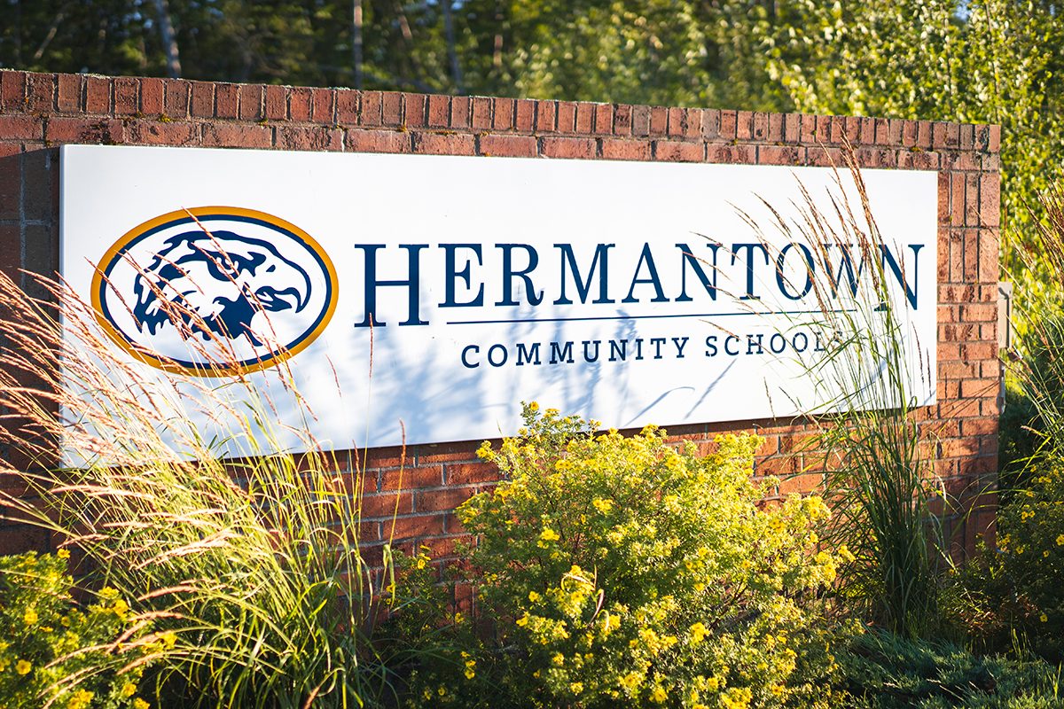
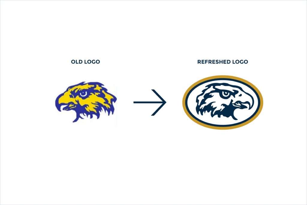
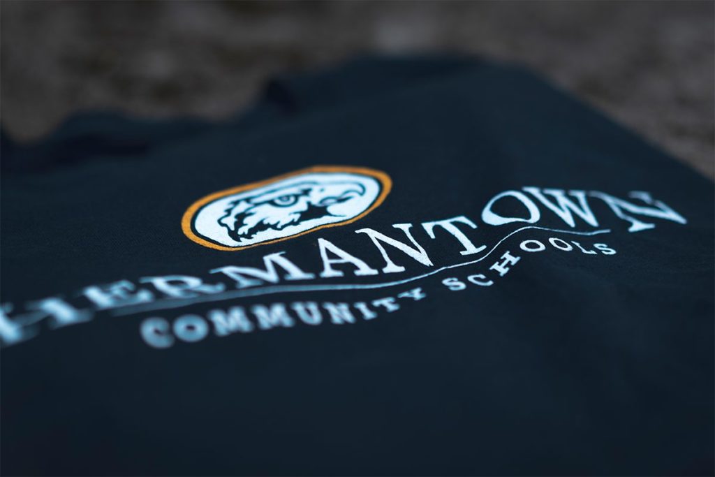
Sometimes, all you need is a brand refresh. There’s nothing bad about a beloved logo, except for 50 different versions of it being thrown around. That was exactly what was happening at Hermantown Schools. In the 70s, an art teacher had illustrated an epic logo of a hawk’s head. While it was much loved, it was much abused. Different renderings existed everywhere.
Our designers took the original logo and pared it down. They refined details and cleaned up lines. The resulting logo felt refreshed.
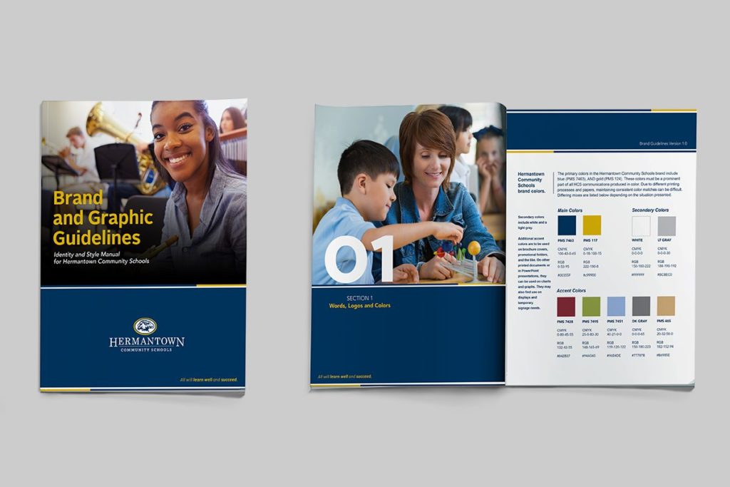
Brand Standards Doc
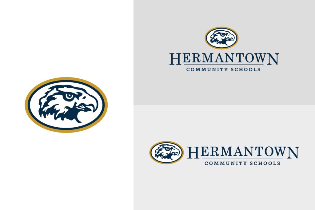
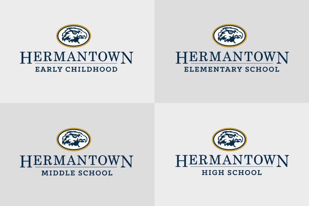
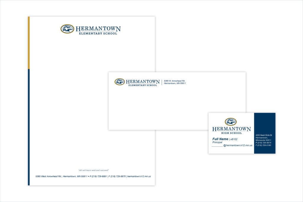
Along with the updated logo, we created a shiny new brand standards doc. This gave everyone a resource to look to when wondering about proper logo usage.
Hermantown could now teach without worrying about pesky, not-quite-right-bird logos flying all over the place.