The Depot Website Revamp
Building a new home for a new legacy.
The Depot website needed an overhaul. The Depot was in the process of repositioning itself from “the train museum” to a community cultural center. It was ready for the website to reflect that. They worked with us to create a site that accurately captured its new brand and felt interactive and fun.
This project went off the tracks in a good way.
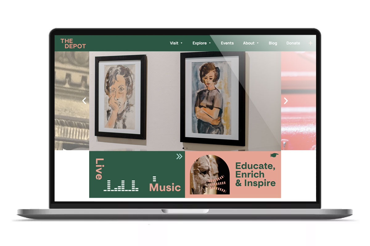
The Depot was the place to find local history, arts, and culture. Several groups, including the Minnesota Ballet, Duluth Playhouse, and Duluth Art Institute, had found a home within its walls.
The new website needed to highlight all the Duluth Depot stands for and its new brand work by another local designer. With only two months until a December 1st deadline, our designers and developers went to work.
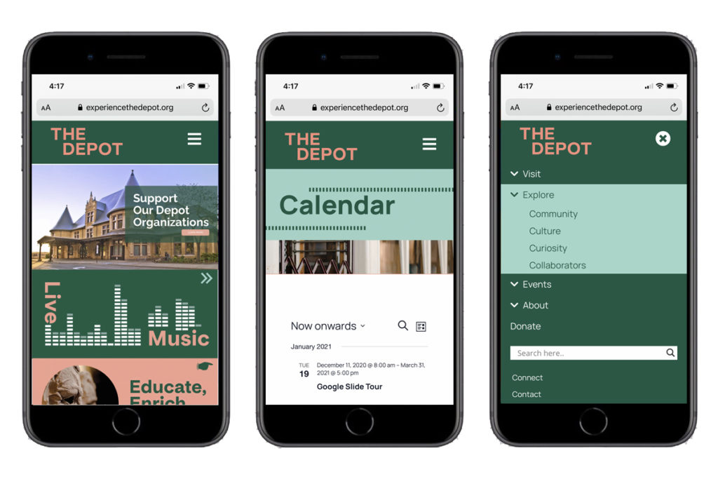
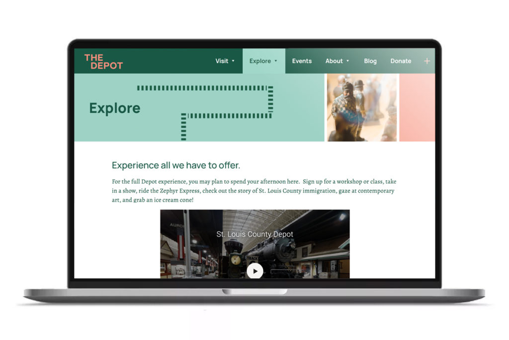
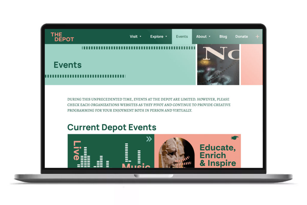
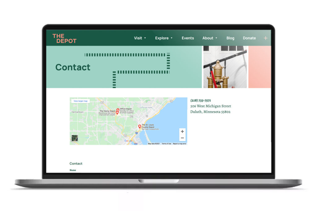
Taking the brand guidelines, we interwove the look and feel into every page. Train track graphics danced across the page, giving the site a playful atmosphere and paying homage to its history as a train station. Despite being the home for many organizations and information, The Depot website feels simple and easy to navigate. A calendar was implemented to give users an overall look at upcoming events. Every part of the website is built to be easily managed by internal team members.
The results were a bold new site that captured the exciting new chapter of The Depot.
